
Most advice about local business websites obsesses over getting more traffic. More SEO, more ads, more clicks. That's fine until you realize the bigger leak is usually on the other end. You're already getting visitors, and most of them leave without calling.
A high-converting website for a local business fixes that end of the problem. It takes the people who already found you and turns more of them into phone calls and form fills. Same traffic, more customers. Below is what that kind of site actually has on it, zone by zone, with no jargon.
What "converting" means for a local business
For an e-commerce store, a conversion is a sale. For a plumber, a roofer, or a med spa, it's simpler. A conversion is someone contacting you: a phone call, a form submission, a booking. That's the whole job of the site.
So a high-converting website isn't the prettiest one or the one with the most pages. It's the one that makes contacting you the obvious, easy next step from the moment the page loads. Everything below serves that single goal.
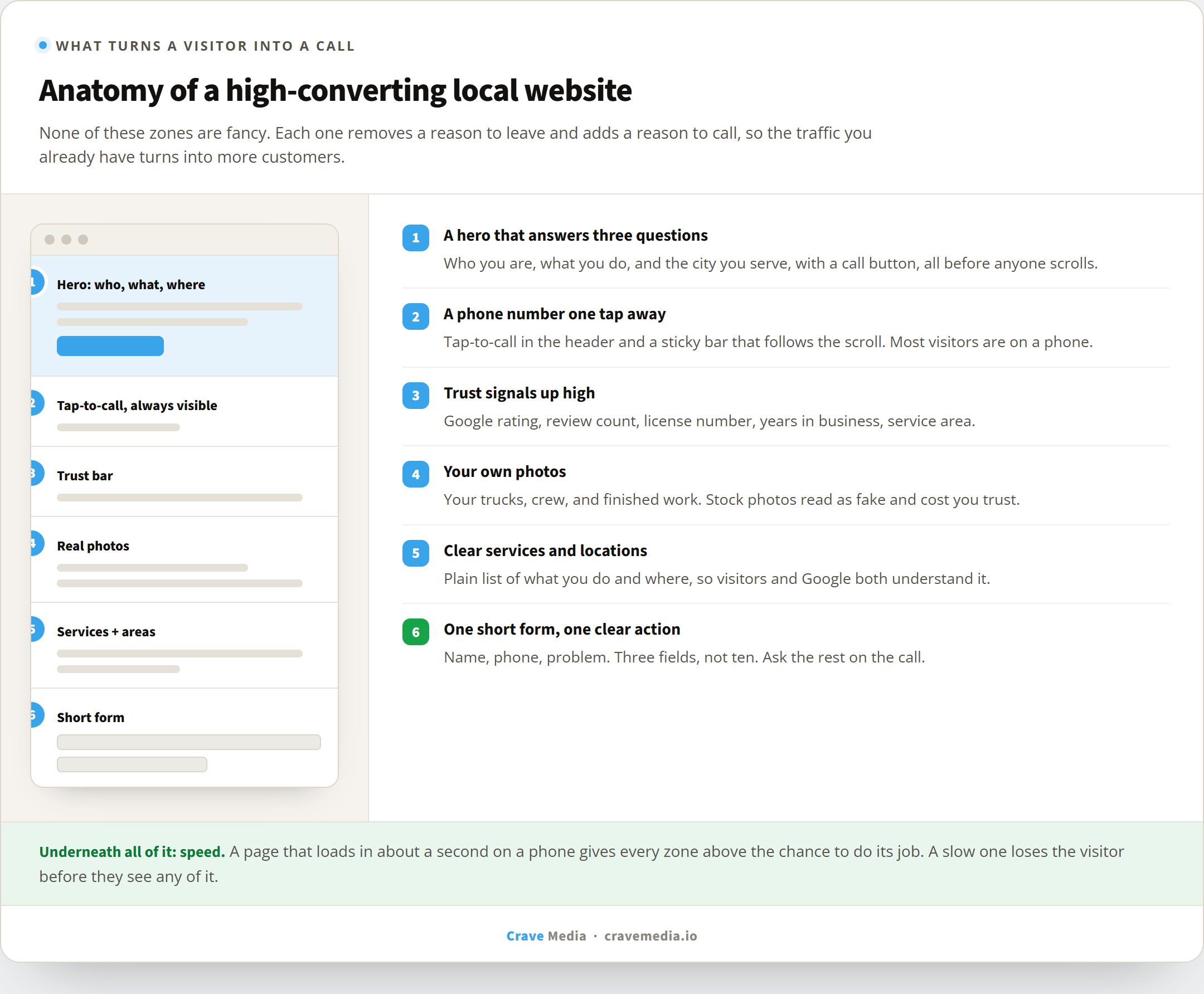
The first screen has to answer three questions
When your page loads, a visitor decides in a couple of seconds whether they're in the right place. The top of the page, before anyone scrolls, has to answer three things fast: who you are, what you do, and how to reach you. Add the city you serve and you've answered the only questions a ready-to-hire customer is asking.
That means a headline that names the service and the area ("Emergency plumbing in Salt Lake City"), not a vague slogan like "Quality you can trust." It means your phone number sitting up top where a thumb can reach it. And it means a button that does one clear thing: call, or book, or get a quote.
The most common mistake we see is a beautiful hero image with no point. Gorgeous photo, zero information. The visitor can't tell what you do or how to hire you, so they bounce back to Google and call the next result.
The page zones that do the converting. None of them are fancy. They just make hiring you the easy choice.
Make the phone impossible to miss
On a local site, the phone number is the most important pixel on the page. It should be visible in the header, tappable on mobile so a tap dials it, and repeated near every section where someone might be ready to act.
Most of your visitors are on a phone. A number they have to copy, switch apps, and paste is a number that doesn't get dialed. Click-to-call removes that friction. A sticky bar that keeps the call button on screen as they scroll removes even more.
This sounds obvious, and it gets missed constantly. We regularly audit local sites where the phone number only appears once, in tiny gray text, in the footer.
Trust signals do the quiet selling
A stranger is about to let you into their home or hand you a few thousand dollars. They want a reason to believe you're legitimate before they call. Trust signals give them that reason without you having to say a word.
The ones that move the needle for local businesses are your Google rating and review count, your license or certification numbers, how long you've been in business, and the area you serve. A row of these near the top, plus real reviews further down, does more for your conversion rate than another paragraph about your "commitment to excellence." Reviews matter so much that it's worth a deliberate plan to collect more of them on your Google profile.
And use real photos. Your trucks, your crew, your finished work. Stock images of a smiling model in a hard hat read as fake, and people can smell it. Your own photos, even imperfect ones, prove you exist and do the work.
Speed is the floor everything sits on
None of this matters if the page doesn't load. A visitor who taps your link and waits five seconds is gone before they see your perfect headline or your five-star reviews. Speed isn't a separate topic from conversion; it's the floor the whole thing stands on.
We covered this in depth in why a slow website is costing you customers, so the short version here: a high-converting site loads in about a second on a phone, and a slow one quietly loses the leads your marketing paid to send. Fix the speed first, then the rest of the page gets a chance to do its job.
One clear action, not five
A page that asks for everything gets nothing. The high-converting version gives the visitor one primary action and makes it loud. Call now. Get a free quote. Book online. Pick the one that fits how you actually take work, and let it dominate.
The same goes for forms. Every field you add costs you submissions. For most local businesses, a form needs three things: name, phone, and a sentence about the problem. You can ask the rest on the phone. A ten-field form with a required street address and a dropdown for "how did you hear about us" is where conversions go to die.
Say what you do and where you do it
Clear service and location pages help two audiences at once. They tell a visitor they're in the right place, and they tell Google what to rank you for. A site that buries its services in a single vague paragraph leaves both confused.
List your services plainly. Spell out the towns and neighborhoods you cover. If you want to rank in more than one city, each one usually needs its own page with real content, not a copy-paste with the city name swapped. This is where website work and local SEO start reinforcing each other.
What this is worth
Here's the part that makes all of this pay. When you improve conversion, every other dollar you spend on marketing works harder. The same Google Ads budget books more jobs. The same SEO traffic produces more calls. We've watched a client's contact rate climb after a rebuild without adding a single new visitor, just by removing the friction between landing and calling.
That's the real advantage of fixing your site. You're not buying more traffic. You're keeping the customers your traffic already earned, the ones who were slipping away where you couldn't see them.
Where to start
If you're not sure how your current site stacks up, look at it on your phone the way a customer would. Can you tell what the business does in two seconds? Is the phone number one tap away? Do you trust it? Be honest, because your customers already are.
When we build a website for a local business, every one of these zones is there by design, sitting on a foundation built for speed. If you want to know where yours is leaking leads right now, grab a free audit and we'll walk you through exactly what's working and what's costing you calls.